
Your school website is often the first interaction prospective families, current students, and staff have with your institution. Think of your website’s navigation menu as the main hallway of your school—if it’s cluttered, confusing, or poorly signed, visitors will get lost, frustrated, and may just leave. Effective menu management isn’t just about aesthetics; it’s a critical component of user experience and efficiency.
The importance of clear headings
The top-level headings in your school website’s navigation menu must be instantly recognizable and intuitive. Vague or overly-clever language is no help to good navigation. Your users should know exactly where they’re going before they click. Don’t forget even Ofsted trawl through your website, make it easy for them.
Here are some best practices for main headings:
- Be Direct: Use common, simple terms that cover a broad category, such as “Parents”, “Admissions”, “About Us” and “Contact”.
- Focus on the User: Consider what your primary audiences are looking for. Parents are likely searching for calendars and resources, while prospective families need admissions information.
- Limit the Options: Keep the number of main menu items manageable—ideally between five and seven. Too many choices overwhelm the user and cna cause your menu to wrap over multiple lines.
If you find this a little challenging then look at what other schools are doing or a bit of advice we often give is to target your main stakeholders (Staff, Students, Parents/Carers, Ofsted and the local community).
Utilizing submenus in your school website menu
Once a user clicks a main heading, a well-structured submenu acts as the map for that specific section. This is where you organize all the detailed pages within that category. Submenus are essential for avoiding a chaotic dumping ground of links under a single heading or pages containing mountains of content.
By using submenus, you can neatly group related information, making it easier for a user to scan and locate a specific document or page.
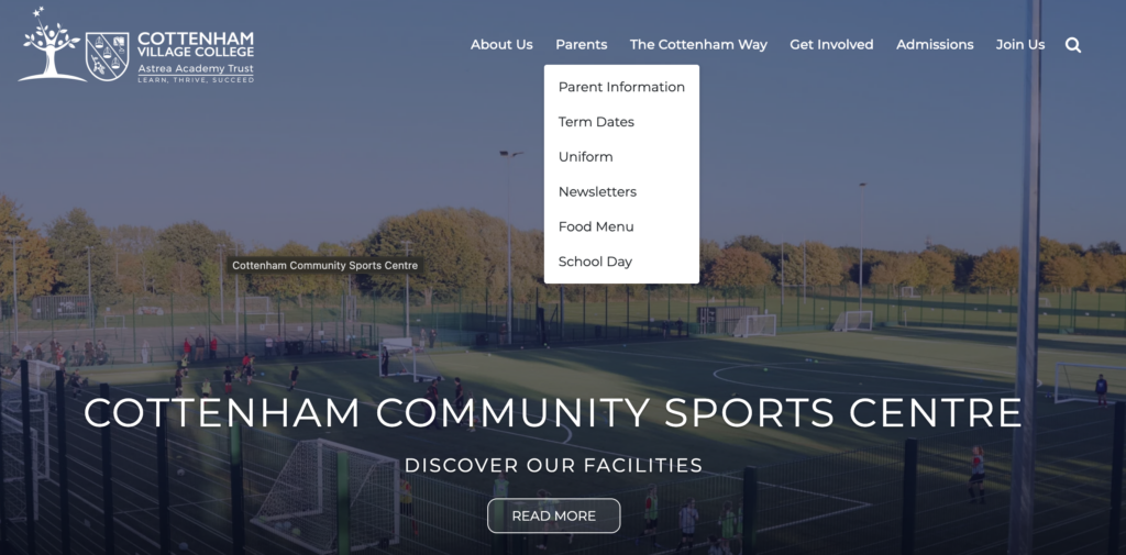
Consider how a “Parents” section can be structured:
- Parents
- Term Dates
- Admissions
- School Lunches
- Uniform
- Letters Home
- Safeguarding
The links above are all pieces of information that we have grouped as being of interest to parents/carers. Our schools at the Astrea Trust are a perfect example and they consistently use this structure across the trust – Astrea Cottenham.
Tips for a well-managed navigation menu
To maintain a pristine navigation system, follow these actionable tips:
- Conduct an Audit: Go through every menu item and ask: “Is this necessary? Is the title clear? Is this the most logical place for this link?”
- Use Descriptive Link Text: Instead of a generic link like “Click Here,” use specific text like “View 2026-2027 Academic Calendar.”
- Review Regularly: School offerings and policies change. Schedule a review of your website’s menu structure every six months, perhaps around the start of a new semester.
- Get External Feedback: Have a parent, a new teacher, or even a community member try to find specific information (like the lunch menu or the school’s mission statement) and note where they struggle.
A clear, well-structured navigation menu is the silent workhorse of your school’s online presence. It minimizes user frustration, enhances accessibility, and ensures that vital information is found quickly and efficiently. Make managing this core element a priority—your community will thank you for it!
If you need any further help with your main menu take a look at our simple guide for managing it here.